Library Website
Redesign the public library website to better serve the English language learner community
Client
Flatiron School project
Role
UX designer (Team: Emily Chang, Vincent Cheung, Andy Agus)
Timing & Tools
6 weeks, 6 sprintsAdobe XD, Draw, Miro, Sketch
Deliverables
Research, analysis, interviews, personas, journey map, task flow, sitemap, wireframes, prototypes, testing
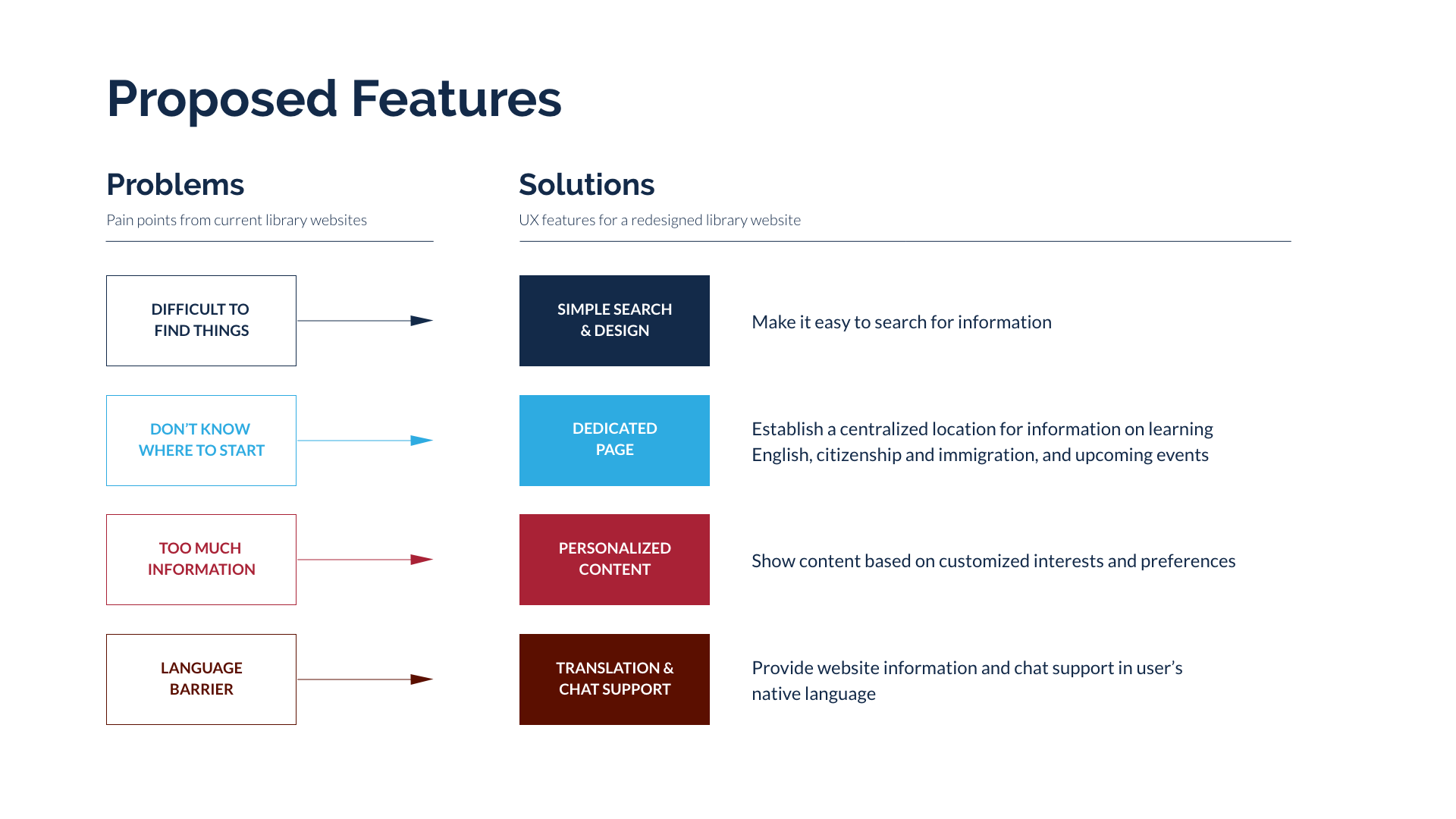
Challenge
A myriad of problems
How can we improve the public library website for English language learners? How do they use the library? Which programs are important to them? What issues do they face in using library services?
Challenge
Conduct research to identify the problems
Determine the optimal feature set
Create initial user flow and interaction design
Conduct research to identify the problems
Determine the optimal feature set
Create initial user flow and interaction design
Research
English language learners & public libraries
A library today does more than just lend out books. It also acts as a community center that provides many programs and services for an increasingly diverse population. The average English language learner, however, does not know about the offerings at the library.
Research
Market research
Competitive analysis
Contextual inquiry
Interviews
Affinity Mapping
Personas
Market research
Competitive analysis
Contextual inquiry
Interviews
Affinity Mapping
Personas
Click on the thumbnails below for larger views


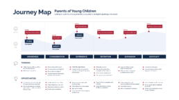
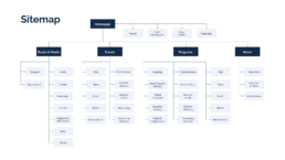
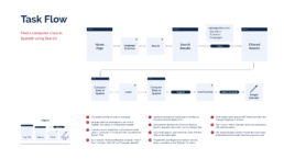
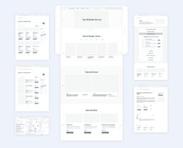
Ideate
Finding the right solutions
The team brainstormed ways to customize the library website for English language learners. We mapped out interactions along touch-points on a journey. We organized the key sections on a sitemap. We prioritized the features that would be most helpful. Then we each designed specific sections and task flows. I was responsible for the following:
Find and register for a computer class in Spanish
Homepage, Events, and Classes sections
Personalization of language and content preferences
Find and register for a computer class in Spanish
Homepage, Events, and Classes sections
Personalization of language and content preferences
Click on the thumbnails for larger views


Testing
Let's see what they think
To evaluate the usability of our prototype, we recruited a mix of librarians, international students, and immigrants from our local libraries — including actual English learners at an English class.
Thirteen users ages 16–70 with varying levels of English literacy and technical knowledge participated. They had three tasks to complete. Afterward, they rated their opinions on each task in a survey.
It took a while for our users to finish the tasks. They clicked in all the wrong places :(
Task 1: Register for a computer class in Spanish
Task 2: Make an appointment with an immigration advisor
Task 3: Find a book to learn English
Task 1: Register for a computer class in Spanish
Task 2: Make an appointment with an immigration advisor
Task 3: Find a book to learn English
Click on the thumbnails below for larger views


Iterate
Let's make it better
With feedback from usability testing, I explored additional ways for users to find and view the computer class. To provide a more customized experience, I also streamlined the design for the personalization process where users set up their content and language preferences.
Provide multiple ways to find & view a class.Streamline the personalization process.
Click on the videos below for demos
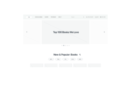
Double the search & make it big
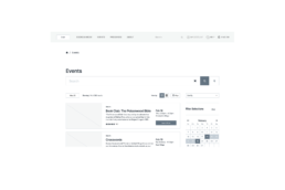
There was only one way to find the class initially — by using the search bar on the nav. A second, large search bar is added to the Events page to facilitate search.
Filter & Sort
Within the Events section, users can filter by a category, location, audience, and language using drop-down menus. Users can also select dates, and sort the information by relevance and popularity.
Choice of views & search on a map
Users can now toggle the page view, between a grid of cards and a list. Users can also search on the map to see what’s near them.
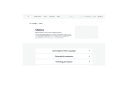
Programs & Classes
From the Programs drop-down menu or Category page, users can navigate to the Classes page with a list of topics. Clicking on the Technology & Computers tab will expand the section to show more information.
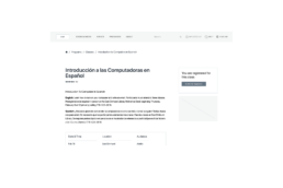
Bilingual class information
The class information is bilingual to make it easier to read for English learners. If a user indicates a language other than English, the class details will be available in both languages.
Personalization setup
Language settings can be changed using the language tab on the top right. Preferences for classes, programs, events, age group, and gender identity can be done through onboarding or My Account page.
Double the search & make it big
There was only one way to find the class initially — by using the search bar on the nav. A second, large search bar is added to the Events page to facilitate search.
Filter & Sort
Within the Events section, users can filter by a category, location, audience, and language using drop-down menus. Users can also select dates, and sort the information by relevance and popularity.
Double the search & make it big
There was only one way to find the class initially — by using the search bar on the nav. A second, large search bar is added to the Events page to facilitate search.
Programs & Classes
From the Programs drop-down menu or Category page, users can navigate to the Classes page with a list of topics. Clicking on the Technology & Computers tab will expand the section to show more information.
Bilingual class information
The class information is bilingual to make it easier to read for English learners. If a user indicates a language other than English, the class details will be available in both languages.
Personalization setup
Language settings can be changed using the language tab on the top right. Preferences for classes, programs, events, age group, and gender identity can be done through onboarding or My Account page.
Learnings
Good intentions don't always translate into good experiences. The team envisioned a convenient, centralized New to the US hub for English language learners. We had hoped our users would navigate the website the way we intended. However, it was more important to give users choices and provide multiple intuitive paths as you would for anyone. Want to know more about this project? Give me a shout.