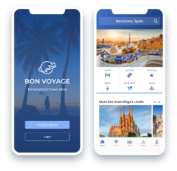
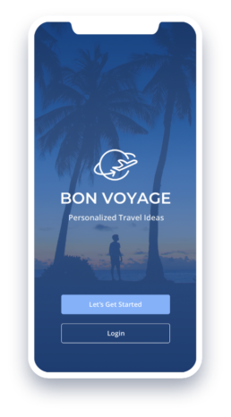
Bon Voyage
A travel app with personalized recommendations to streamline the trip planning process
Client
Flatiron School Project
Role
UX/UI designer
Timing & Tools
6 weeks, 6 sprintsSketch, Invision
Deliverables
Research, analysis, persona, user flows, style tiles, wireframes, prototypes, testing
Challenge
Make travel planning easier
Researching a trip can be fun, but it can also be overwhelming with the dizzying array of options. Design a travel app that provides information and recommendations about where people can go and what to see in different destinations. Create the best experience possible by making the trip planning process more efficient and enjoyable.
Challenge
Conduct research to define problems & opportunities
Determine features & interaction design
Develop visual design & prototype
Conduct research to define problems & opportunities
Determine features & interaction design
Develop visual design & prototype
Research
Understanding the context & issues
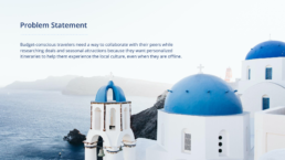
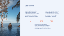
I began the design thinking process by surveying the competitive and market landscapes and discovering the dominant trends. I analyzed the user interview transcripts provided to empathize with the users’ goals and needs. The findings informed the design of the persona, problem statement, and user stories. These artifacts helped guide the development of user-centric solutions.
Research
Market research
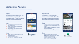
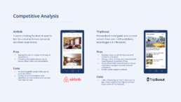
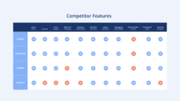
Competitive analysis
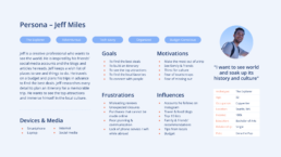
Persona
Problem statement
User stories
Market research
Competitive analysis
Persona
Problem statement
User stories
Click on the thumbnails below for larger views
Ideate
iterations on Interaction design
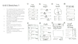
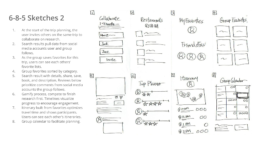
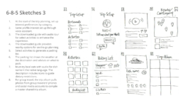
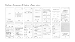
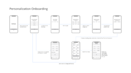
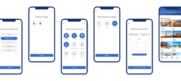
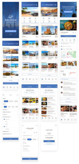
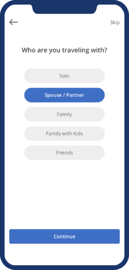
I brainstormed ideas through a series of quick 6-8-5 sketches. The project’s timing constraints narrowed the scope to the foodie traveler looking for affordable and authentic food options. The user flow for finding a restaurant and making a reservation was developed, along with the personalization onboarding to customize recommendations.
Click on the thumbnails for larger views
Design
Visual design & high-fidelity mockups
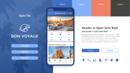
Exploring the look and feel was streamlined through style tiles. The high fidelity wireframes were designed using Sketch and prototyped in Invision.
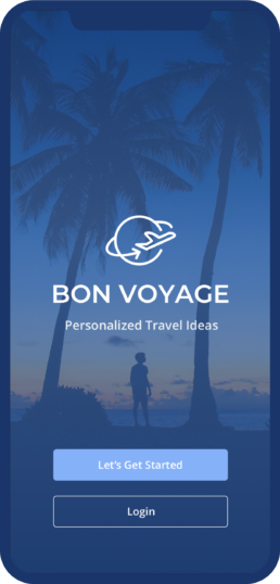
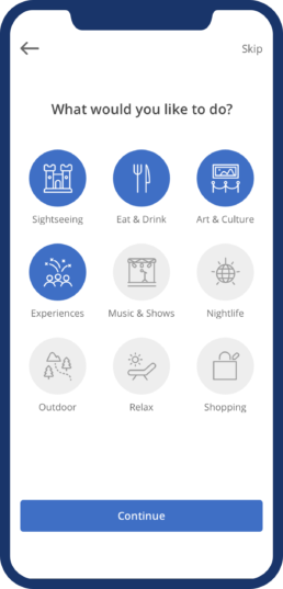
Screens for personalization onboarding
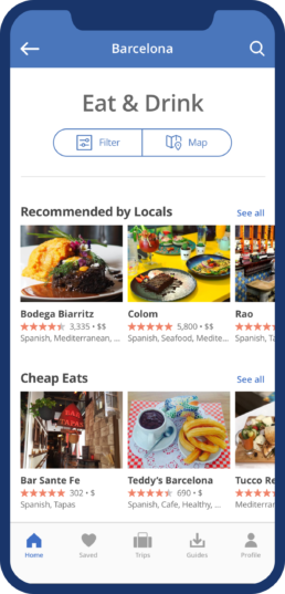
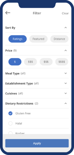
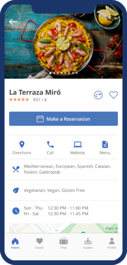
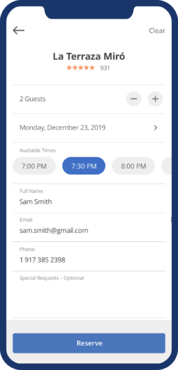
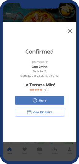
Screens for finding a restaurant & making a reservation
Tech-Savvy Travelers
Usability testing was conducted remotely with four participants who averaged 3–5 trips a year and used travel apps including Priceline, TripAdvisor, and Airbnb. They were briefed on the task and the scenario. They shared their thoughts as they navigated through the app. I observed their interactions and followed up with a series of questions. Afterward, they rated their experience and specific features on a scale of 1–5.
The Task
Make a restaurant reservation for you and your friend for your upcoming trip to Barcelona, Spain.
The Scenario
You and your friend are planning a trip. You are using a new travel app called Bon Voyage that uses artificial intelligence to make personalized recommendations for you. Based on your interests, budget, and preferences, the app gives you some options. You choose Barcelona, Spain. You want to try authentic Spanish food and use the app to find restaurants and make a reservation.
Results
Concept validated
Overall the users liked the idea of personalized travel recommendations and felt that it made the trip planning process easier.
“The app puts everything for you in one place, that’s what I like most about it.”
— Alena
100%
It was easy to use.
100%
Completed the restaurant reservation task.
100%
App provided comprehensive trip planning tools.
100%
Like the look & feel of the app — “it’s clean, simple, and polished”.
Personalization
100% Streamlined the trip planning process.
25% Want more options for activities and climate.
25% Would skip section if there’s a destination in mind.
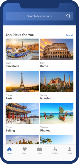
Top Picks for You
50% Personalized Top Picks makes travel planning easier.
25% Want to see more images for Top Picks.
25% Want to know if Top Picks are sponsored or unbiased.
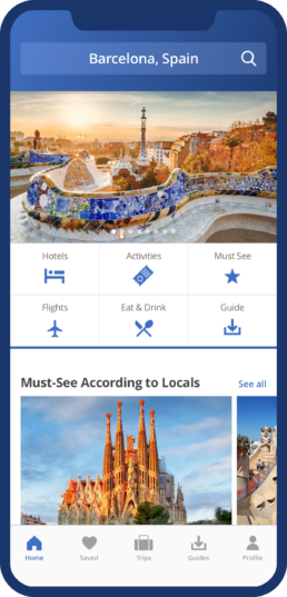
Destination Homepage
100% Like the comprehensive categories of content.
50% Like seeing prices provided.
100% Missed the “Downloadable Guide” feature.
Eat & Drink
100% Like having the option to search using Filter or within Map.
50% Like the “Cheap Eats” section.
Restaurant Filter
25% Like options for Dietary Restrictions.
25% Want filter for payment options.
25% Want filter for smoking or non-smoking.
Restaurant Page
100% Like the in-depth restaurant details.
25% Like seeing reviews and photos.
25% Want details on payment options & smoking or non-smoking.
Reservation
100% Making a reservation was easy.
100% It’s convenient to make a reservation directly from the restaurant page.
Confirmation
100% Like the ability to Share.
50% Confused by the “View Itinerary” label.
Learnings
Bon Voyage was my first venture into product design at the Flatiron School. It illustrated for me the importance of testing early and often. Certain issues did not surface until testing and seeing how users interact with the prototype. Designers are so close to the work sometimes that we can get lost in the details. It helps to get a fresh perspective from real users. Want to know more about this project? Give me a shout.
